Hi!
I’m Mihaela Mihova
UX/UI designer from Bulgaria
View my work

Selected work
Apple Glow
Project overview
This is a case study about a conceptual product for enhancing Apple’s HomeKit with AI

Apple Glow
UX Case Study (Conceptual)
Tools used:

My role
Concept Creator
Concept Creator
Journey map
Prototyping
Competitive analysis
Defined visual identity
User flow
User Research
User persona
The Apple Glow
Experience
The mirror is not active
When Apple Glow is inactive, it’s display is darker and in power saving mode

9:41
Mon Jun 6


100%


9:41AM
Cupertino

12
11
10
9
8
7
6
5
4
3
2
1


+1.78
AAPL


AQI
27

78
50
67
Conference Room
Design Review
11:30AM-12:30PM

Mon Jun

Good morning
When you walk in the bathroom the edges start glowing, and Siri greets you with a GOOD MORNING.
After the greeting, Apple glow goes in active mode
It gives you a few minutes for you to use the utilities.
9:41
Mon Jun 6
100%

9:41AM
Cupertino
12
11
10
9
8
7
6
5
4
3
2
1
+1.78
AAPL
AQI
27
78
50
67
Conference Room
Design Review
11:30AM-12:30PM
Mon Jun
Pam

Morning, Glo
Apple Glow
Good morning Pam!

Good morning
Apple Glow learns what products you own, as time passes. At first it suggests a product and asks if you own one. As you use it, using the camera Glow detects the products brand and type.
Mon Jun

Pam

Thanks! What are we doing today? Tell me what I need.
Pam

Thanks for the lip oil tip!
Apple Glow
I am exited for our first morning!
Your skin looks amazing this morning!

Apple Glow
For today I recommend a little eye cream and sunscreen.

Apple Glow
If you own lip oil, put a little on your lips before going out- it’s windy today.

Siri learns
As it scans the product it detects how much is left in the product ( I don’t know how yet maybe searches the web for grams and how to use terms). When Glow thinks you might be close to running out on something, it sends you a notification or tells you right away.
Pam

I’m not really sure I love this one. We can search for a better one.

Apple Glow
It looks that you are struggling with your sunscreen. Do you want me to order you a new one? It will arrive right when this one is empty.

UX.Report
Project overview
This is a case study about lowering high bounce rates and addressing low conversion rates on the platform.

Improve the UX.Report Platform
Case Study
7 min read
20 Dec 2024
Project Course
SoftUni Design Advanced
Usability evaluation
Insights, recommendations and research highlights.
Learnability
Bad
Show of password toggle option
I recommend adding a toggle option to show password when typing or when done.
Efficiency
Room to improve
Landing page has an option for the potential customer to ask questions.
When a customer clicks on CONTACT, it send them directly in their Email platform. The option is there, but I think there is supposed to be a quick form users can type out a question and not an email. Some customers might be put off be having to send an official email to the company.
Learnability, Error
Room to improve
UI Elements are easily accessible on mobile and big enough to prevent misclicks
I recommend increasing the white space around the objects
Carl Caterpillar
Good
The website does not require entering the same data more than once
There is only one place to enter password, you don’t have to type it twice.
Efficiency
Bad
Main product visual is not attractive.
We need some kind of dashboard that shows what the product looks like when you onw it. We don’t have a preview anywhere, so it’s a a little off putting that we ask for the customer to buy, but not show them what they are actually buying.
Efficiency
Good
The home page is professionally designed and it creates a positive first impression
Everything is visible, there is enough white space. The hierarchy between the main text and the secondary one is good. The page is balanced.
Main visual
(Dashboard)
<
All Audits
Hero Block
Problem Agitation
Clear solution
Social proof
Desired action
Storytelling
Support

Mihaela Mihova
eli.mihova.vm@gmail...
QuEx Landing page results
Hero block
32%
Problem agitation
22%
Social proof
23%
Desired Action
12%
Clear solution
65%
Storytelling
42%
itasse risus elementum erat amet put
cies sapien purus eleifend. Eros dignissim diam sed donec pretium. Nibh placerat volutpat aliquam tellus
Lorem ipsum dolor sit amet consectetur. Auctor et dui id gravida orci vel aliquam donec. Velit commodo
an venenatis dolor ullamcorper sagittis. Tincidunt arcu vestibulum malesuada nec faucibus tristique lore
scelerisque mauris amet. Lorem blandit scelerisque gravida semper in. Sit varius
amet purus mauris egestas. Quam egestas facilisi elit sed volutpat. Pulvinar auctor scelerisque ma
Overall Score
26%
Education
UX/UI Design
Softuni, Diploma
2025
Graphic Design
Softuni, Courses
2024
Digital Markering
Softuni, Courses
2021
Fashion Design
New Bulgarian University
Vocational High school of Clothing and Design

A little about me

Art and design have always been a part of my life in one way or another. I studied Fashion Design in high school and university, fully convinced I’d be the next big name in the industry… until I realised I preferred designing for fun rather than as a career. That led me to graphic design, where I dove into the SoftUni program. A few courses and certificates later, here I am, turning that passion into reality.
See more
Let’s work together

Hi!
I’m Mihaela Mihova
UX/UI designer from Bulgaria
View my work

Selected work
Apple Glow
Project overview
This is a case study about a conceptual product for enhancing Apple’s HomeKit with AI

Apple Glow
UX Case Study (Conceptual)
Tools used:

My role
Concept Creator
Concept Creator
Journey map
Prototyping
Competitive analysis
Defined visual identity
User flow
User Research
User persona
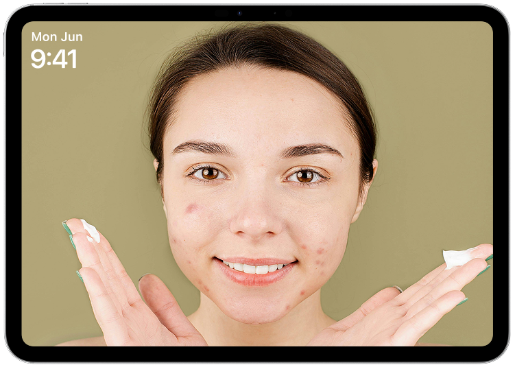
The Apple Glow Experience
Scanning and morning routine
The Apple Glow Experience
First scanning of the face
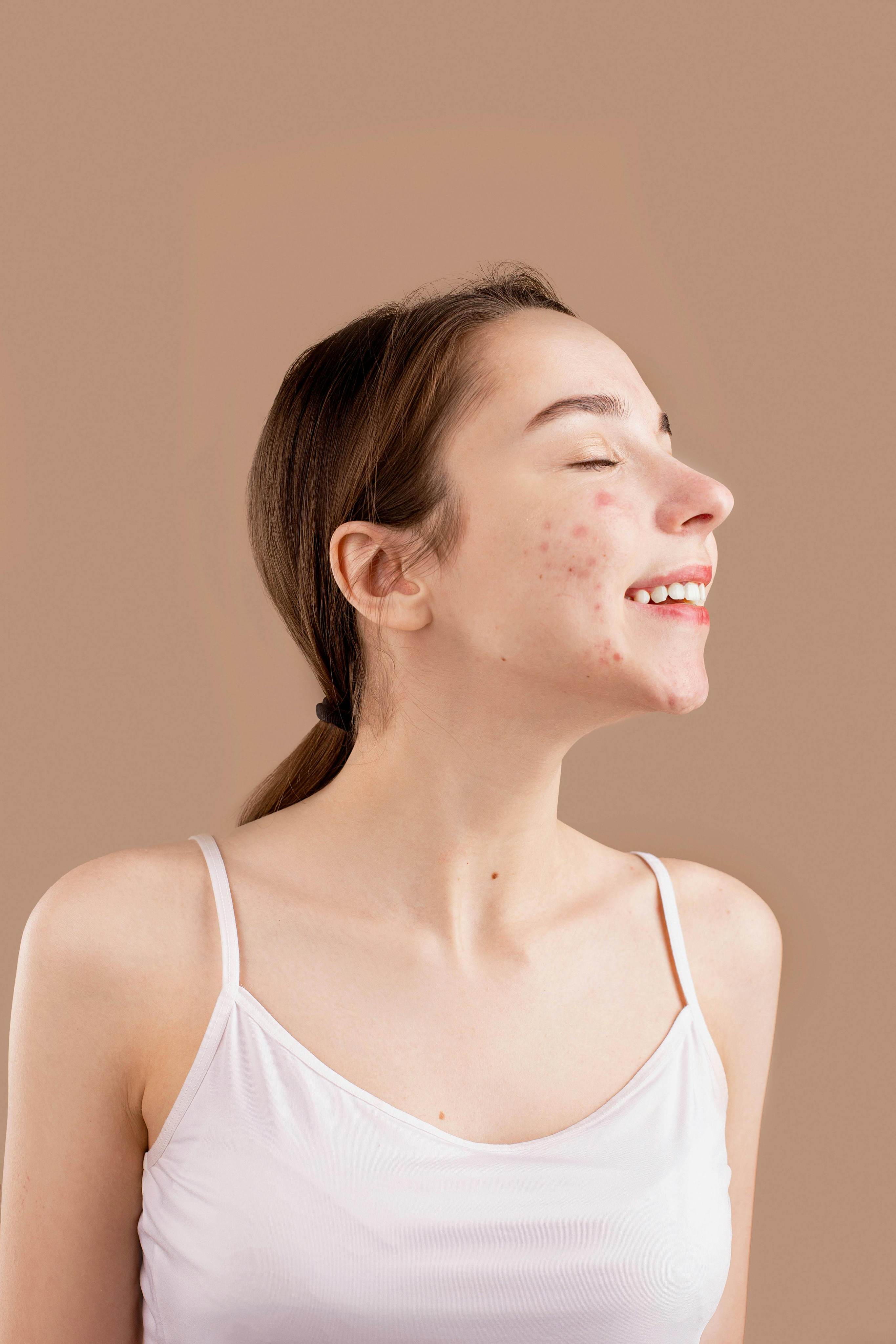
Siri scans Pam’s face.
Mon Jun

This is what Apple Glow
Sees as it scans the skin
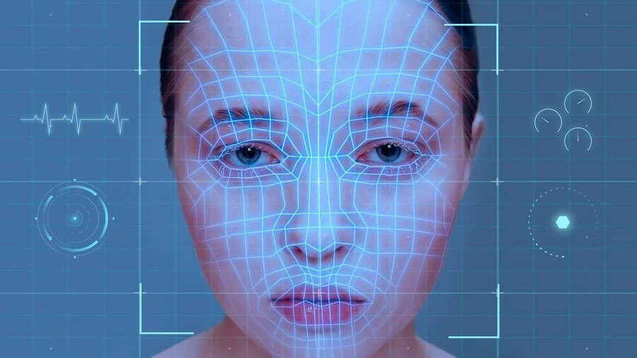
Apple Glow informs Pam
of the results
After the scan is complete, Siri tells Pam what it sees. It recommends types of products that will help.
Mon Jun

Pam

Yep, I’m aware.
Apple Glow
These are the products I recommend. If you don’t have them I can order them for you.

Apple Glow
- Acne solution
- Oil based cleanser
- Azaelic acid
- Retinol Serum
- Probiotic Gel Moisturizer

Apple Glow
From what I can see your skin is mostly dry, except your T-zone.

Apple Glow
I have to warn you that I am a virtual assistant and not a medical doctor. Keep that in mind.

Apple Glow
I can see that you have Rosacea, that manifest itself on your cheeks, and Moderate acne all around your face.

Siri offers brands
for the products
Pam says what she dose not have and they plan a purcase
Mon Jun
Pam

I have everything besides the Gel and serum.
Pam

I dont’t like The ordinary.
Pam

Them I like.
Apple Glow
Great! Here are brands that I recommend that you try.

Apple Glow
How about La Roche Posay retinol serum B3?

Apple Glow
- Biossance Probiotic Gel Moisturiser
- The Ordinary Retinol Serum 1%

Apple Glow
Great! I will find the best offers for these products and if you approve of the prices, I will order them.

The mirror is not active
When Apple Glow is inactive, it’s display is darker and in power saving mode
9:41
Mon Jun 6


100%


9:41AM
Cupertino

12
11
10
9
8
7
6
5
4
3
2
1


+1.78
AAPL


AQI
27

78
50
67
Conference Room
Design Review
11:30AM-12:30PM

Mon Jun
Good morning
When you walk in the bathroom the edges start glowing, and Siri greets you with a GOOD MORNING.
After the greeting, Apple glow goes in active mode
It gives you a few minutes for you to use the utilities.
9:41
Mon Jun 6


100%


9:41AM
Cupertino

12
11
10
9
8
7
6
5
4
3
2
1


+1.78
AAPL


AQI
27

78
50
67
Conference Room
Design Review
11:30AM-12:30PM

Mon Jun
Pam

Morning, Glo
Apple Glow
Good morning Pam!

Good morning
Apple Glow learns what products you own, as time passes. At first it suggests a product and asks if you own one. As you use it, using the camera Glow detects the products brand and type.
Mon Jun

Pam

Thanks! What are we doing today? Tell me what I need.
Pam

Thanks for the lip oil tip!
Apple Glow
I am exited for our first morning!
Your skin looks amazing this morning!

Apple Glow
For today I recommend a little eye cream and sunscreen.

Apple Glow
If you own lip oil, put a little on your lips before going out- it’s windy today.

Siri learns
As it scans the product it detects how much is left in the product ( I don’t know how yet maybe searches the web for grams and how to use terms). When Glow thinks you might be close to running out on something, it sends you a notification or tells you right away.
Pam

I’m not really sure I love this one. We can search for a better one.
Apple Glow
It looks that you are struggling with your sunscreen. Do you want me to order you a new one? It will arrive right when this one is empty.

UX.Report
Project overview
This is a case study about lowering high bounce rates and addressing low conversion rates on the platform.

Improve the UX.Report Platform
Case Study
7 min read
20 Dec 2024
Project Course
SoftUni Design Advanced
Usability evaluation
Insights, recommendations and research highlights.
Learnability
Bad
Show of password toggle option
I recommend adding a toggle option to show password when typing or when done.
Efficiency
Room to improve
Landing page has an option for the potential customer to ask questions.
When a customer clicks on CONTACT, it send them directly in their Email platform. The option is there, but I think there is supposed to be a quick form users can type out a question and not an email. Some customers might be put off be having to send an official email to the company.
Learnability, Error
Room to improve
UI Elements are easily accessible on mobile and big enough to prevent misclicks
I recommend increasing the white space around the objects
Carl Caterpillar
Good
The website does not require entering the same data more than once
There is only one place to enter password, you don’t have to type it twice.
Efficiency
Bad
Main product visual is not attractive.
We need some kind of dashboard that shows what the product looks like when you onw it. We don’t have a preview anywhere, so it’s a a little off putting that we ask for the customer to buy, but not show them what they are actually buying.
Efficiency
Good
The home page is professionally designed and it creates a positive first impression
Everything is visible, there is enough white space. The hierarchy between the main text and the secondary one is good. The page is balanced.
Main visual
(Dashboard)
<
All Audits
Hero Block
Problem Agitation
Clear solution
Social proof
Desired action
Storytelling
Support

Mihaela Mihova
eli.mihova.vm@gmail...
QuEx Landing page results
Hero block
32%
Problem agitation
22%
Social proof
23%
Desired Action
12%
Clear solution
65%
Storytelling
42%
itasse risus elementum erat amet put
cies sapien purus eleifend. Eros dignissim diam sed donec pretium. Nibh placerat volutpat aliquam tellus
Lorem ipsum dolor sit amet consectetur. Auctor et dui id gravida orci vel aliquam donec. Velit commodo
an venenatis dolor ullamcorper sagittis. Tincidunt arcu vestibulum malesuada nec faucibus tristique lore
scelerisque mauris amet. Lorem blandit scelerisque gravida semper in. Sit varius
amet purus mauris egestas. Quam egestas facilisi elit sed volutpat. Pulvinar auctor scelerisque ma
Overall Score
26%
Education
UX/UI Design
Softuni, Diploma
2025
Graphic Design
Softuni, Courses
2024
Digital Markering
Softuni, Courses
2021
Fashion Design
- New Bulgarian University
- Vocational High school of Clothing and Design
2018
A little about me

Art and design have always been a part of my life in one way or another. I studied Fashion Design in high school and university, fully convinced I’d be the next big name in the industry… until I realised I preferred designing for fun rather than as a career. That led me to graphic design, where I dove into the SoftUni program. A few courses and certificates later, here I am, turning that passion into reality.
See more
Let’s work together

Hi!
I’m Mihaela Mihova
UX/UI designer from Bulgaria
View my work

Selected work
Apple Glow
Project overview
This is a case study about a conceptual product for enhancing Apple’s HomeKit with AI

Apple Glow
UX Case Study (Conceptual)
Tools used:

My role
Concept Creator
Concept Creator
Journey map
Prototyping
Competitive analysis
Defined visual identity
User flow
User Research
User persona
The Apple Glow Experience
Scanning and morning routine
The Apple Glow Experience
First scanning of the face
Siri scans Pam’s face.
Mon Jun

This is what Apple Glow
Sees as it scans the skin
Apple Glow informs Pam
of the results
After the scan is complete, Siri tells Pam what it sees. It recommends types of products that will help.
Mon Jun

Pam

Yep, I’m aware.
Apple Glow
These are the products I recommend. If you don’t have them I can order them for you.

Apple Glow
- Acne solution
- Oil based cleanser
- Azaelic acid
- Retinol Serum
- Probiotic Gel Moisturizer

Apple Glow
From what I can see your skin is mostly dry, except your T-zone.

Apple Glow
I have to warn you that I am a virtual assistant and not a medical doctor. Keep that in mind.

Apple Glow
I can see that you have Rosacea, that manifest itself on your cheeks, and Moderate acne all around your face.

Siri offers brands
for the products
Pam says what she dose not have and they plan a purcase
Mon Jun
Pam

I have everything besides the Gel and serum.
Pam

I dont’t like The ordinary.
Pam

Them I like.
Apple Glow
Great! Here are brands that I recommend that you try.

Apple Glow
How about La Roche Posay retinol serum B3?

Apple Glow
- Biossance Probiotic Gel Moisturiser
- The Ordinary Retinol Serum 1%

Apple Glow
Great! I will find the best offers for these products and if you approve of the prices, I will order them.

The mirror is not active
When Apple Glow is inactive, it’s display is darker and in power saving mode
9:41
Mon Jun 6


100%


9:41AM
Cupertino

12
11
10
9
8
7
6
5
4
3
2
1


+1.78
AAPL


AQI
27

78
50
67
Conference Room
Design Review
11:30AM-12:30PM

Mon Jun
Good morning
When you walk in the bathroom the edges start glowing, and Siri greets you with a GOOD MORNING.
After the greeting, Apple glow goes in active mode
It gives you a few minutes for you to use the utilities.
9:41
Mon Jun 6


100%


9:41AM
Cupertino

12
11
10
9
8
7
6
5
4
3
2
1


+1.78
AAPL


AQI
27

78
50
67
Conference Room
Design Review
11:30AM-12:30PM

Mon Jun
Pam

Morning, Glo
Apple Glow
Good morning Pam!

Good morning
Apple Glow learns what products you own, as time passes. At first it suggests a product and asks if you own one. As you use it, using the camera Glow detects the products brand and type.
Mon Jun

Pam

Thanks! What are we doing today? Tell me what I need.
Pam

Thanks for the lip oil tip!
Apple Glow
I am exited for our first morning!
Your skin looks amazing this morning!

Apple Glow
For today I recommend a little eye cream and sunscreen.

Apple Glow
If you own lip oil, put a little on your lips before going out- it’s windy today.

Siri learns
As it scans the product it detects how much is left in the product ( I don’t know how yet maybe searches the web for grams and how to use terms). When Glow thinks you might be close to running out on something, it sends you a notification or tells you right away.
Pam

I’m not really sure I love this one. We can search for a better one.
Apple Glow
It looks that you are struggling with your sunscreen. Do you want me to order you a new one? It will arrive right when this one is empty.

UX.Report
Project overview
This is a case study about lowering high bounce rates and addressing low conversion rates on the platform.

Improve the UX.Report Platform
Case Study
7 min read
20 Dec 2024
Project Course
SoftUni Design Advanced
Usability evaluation
Insights, recommendations and research highlights.
Learnability
Bad
Show of password toggle option
I recommend adding a toggle option to show password when typing or when done.
Efficiency
Room to improve
Landing page has an option for the potential customer to ask questions.
When a customer clicks on CONTACT, it send them directly in their Email platform. The option is there, but I think there is supposed to be a quick form users can type out a question and not an email. Some customers might be put off be having to send an official email to the company.
Learnability, Error
Room to improve
UI Elements are easily accessible on mobile and big enough to prevent misclicks
I recommend increasing the white space around the objects
Efficiency
Good
The website does not require entering the same data more than once
There is only one place to enter password, you don’t have to type it twice.
Efficiency
Bad
Main product visual is not attractive.
We need some kind of dashboard that shows what the product looks like when you onw it. We don’t have a preview anywhere, so it’s a a little off putting that we ask for the customer to buy, but not show them what they are actually buying.
Efficiency
Good
The home page is professionally designed and it creates a positive first impression
Everything is visible, there is enough white space. The hierarchy between the main text and the secondary one is good. The page is balanced.
Main visual
(Dashboard)
<
All Audits
Hero Block
Problem Agitation
Clear solution
Social proof
Desired action
Storytelling
Support
Mihaela Mihova
eli.mihova.vm@gmail...
QuEx Landing page results
Hero block
32%
Problem agitation
22%
Social proof
23%
Desired Action
12%
Clear solution
65%
Storytelling
42%
itasse risus elementum erat amet put
cies sapien purus eleifend. Eros dignissim diam sed donec pretium. Nibh placerat volutpat aliquam tellus
Lorem ipsum dolor sit amet consectetur. Auctor et dui id gravida orci vel aliquam donec. Velit commodo
an venenatis dolor ullamcorper sagittis. Tincidunt arcu vestibulum malesuada nec faucibus tristique lore
scelerisque mauris amet. Lorem blandit scelerisque gravida semper in. Sit varius
amet purus mauris egestas. Quam egestas facilisi elit sed volutpat. Pulvinar auctor scelerisque ma
Overall Score
26%
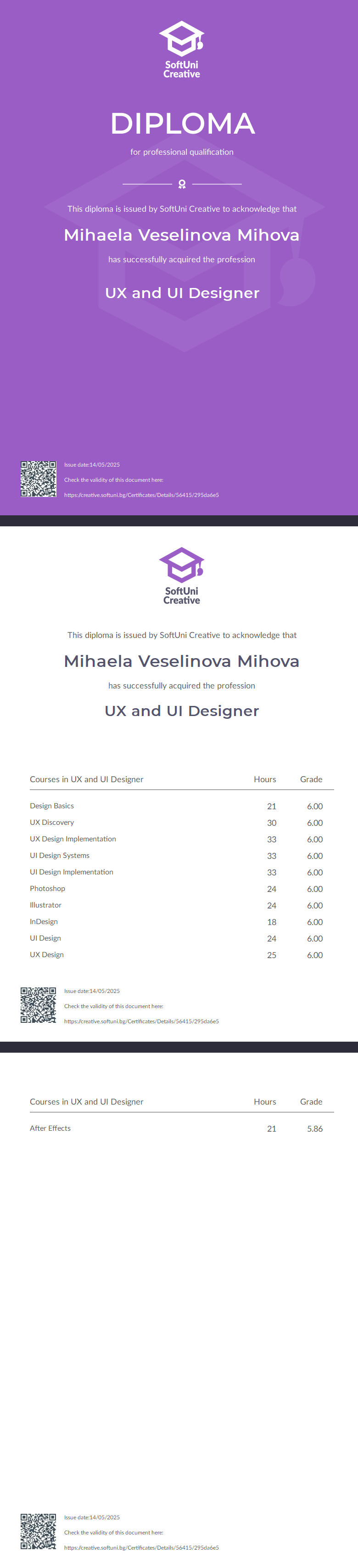
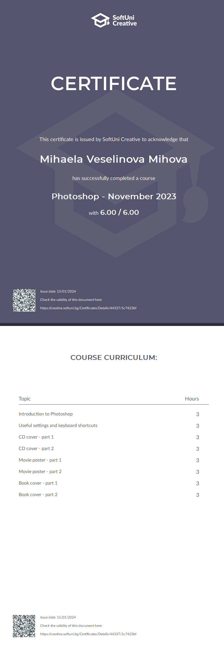
Education
UX/UI Design
Softuni, Diploma
2025
Graphic Design
Softuni, Courses
2024
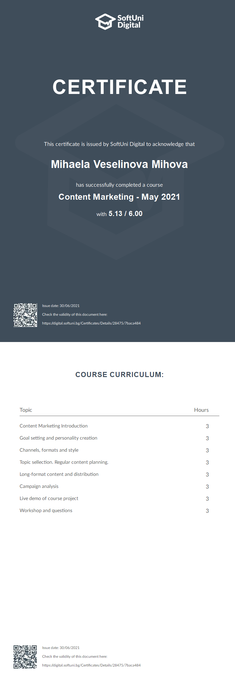
Digital Marketing
Softuni, Courses
2021
Fashion Design
- New Bulgarian University
- High school of Design
2018
A little about me

Art and design have always been a part of my life in one way or another. I studied Fashion Design in high school and university, fully convinced I’d be the next big name in the industry… until I realised I preferred designing for fun rather than as a career. That led me to graphic design, where I dove into the SoftUni program. A few courses and certificates later, here I am, turning that passion into reality.
See more
Let’s work together

Hi!
I’m Mihaela Mihova
UX/UI designer from Bulgaria
View my work
Selected work
Apple Glow
Project overview
Apple Glow is a product concept that i created when tasked with expanding Apple’s smart home kit.

Apple Glow
UX Case Study (Conceptual)
Tools used:

My role
Concept Creator
Concept Creator
Journey map
Prototyping
Competitive analysis
Defined visual identity
User flow
User Research
User persona
The Apple Glow Experience
Scanning and morning routine
The Apple Glow Experience
First scanning of the face
Siri scans Pam’s face.
Mon Jun
This is what Apple Glow
Sees as it scans the skin
Apple Glow informs Pam
of the results
After the scan is complete, Siri tells Pam what it sees. It recommends types of products that will help.
Mon Jun
Pam

Yep, I’m aware.
Apple Glow
These are the products I recommend. If you don’t have them I can order them for you.

Apple Glow
- Acne solution
- Oil based cleanser
- Azaelic acid
- Retinol Serum
- Probiotic Gel Moisturizer

Apple Glow
From what I can see your skin is mostly dry, except your T-zone.

Apple Glow
I have to warn you that I am a virtual assistant and not a medical doctor. Keep that in mind.

Apple Glow
I can see that you have Rosacea, that manifest itself on your cheeks, and Moderate acne all around your face.

Siri offers brands
for the products
Pam says what she dose not have and they plan a purcase
Mon Jun
Pam

I have everything besides the Gel and serum.
Pam

I dont’t like The ordinary.
Pam

Them I like.
Apple Glow
Great! Here are brands that I recommend that you try.

Apple Glow
How about La Roche Posay retinol serum B3?

Apple Glow
- Biossance Probiotic Gel Moisturiser
- The Ordinary Retinol Serum 1%

Apple Glow
Great! I will find the best offers for these products and if you approve of the prices, I will order them.

The mirror is not active
When Apple Glow is inactive, it’s display is darker and in power saving mode
9:41
Mon Jun 6
100%

9:41AM
Cupertino
12
11
10
9
8
7
6
5
4
3
2
1

+1.78
AAPL
AQI
27
78
50
67
Conference Room
Design Review
11:30AM-12:30PM

Mon Jun
Good morning
When you walk in the bathroom the edges start glowing, and Siri greets you with a GOOD MORNING.
After the greeting, Apple glow goes in active mode
It gives you a few minutes for you to use the utilities.
9:41
Mon Jun 6
100%
9:41AM
Cupertino
12
11
10
9
8
7
6
5
4
3
2
1

+1.78
AAPL

AQI
27

78
50
67
Conference Room
Design Review
11:30AM-12:30PM

Mon Jun
Pam
Morning, Glo
Apple Glow
Good morning Pam!
Good morning
Apple Glow learns what products you own, as time passes. At first it suggests a product and asks if you own one. As you use it, using the camera Glow detects the products brand and type.
Mon Jun
Pam
Thanks! What are we doing today? Tell me what I need.
Pam
Thanks for the lip oil tip!
Apple Glow
I am exited for our first morning!
Your skin looks amazing this morning!
Apple Glow
For today I recommend a little eye cream and sunscreen.
Apple Glow
If you own lip oil, put a little on your lips before going out- it’s windy today.
Siri learns
As it scans the product it detects how much is left in the product ( I don’t know how yet maybe searches the web for grams and how to use terms). When Glow thinks you might be close to running out on something, it sends you a notification or tells you right away.
Pam
I’m not really sure I love this one. We can search for a better one.
Apple Glow
It looks that you are struggling with your sunscreen. Do you want me to order you a new one? It will arrive right when this one is empty.
UX.Report
Project overview
This is a case study about lowering high bounce rates and addressing low conversion rates on the platform.

Improve the UX.Report Platform
Case Study
7 min read
20 Dec 2024
Project Course
SoftUni Design Advanced
Usability evaluation
Insights, recommendations and research highlights.
Learnability
Bad
Show of password toggle option
I recommend adding a toggle option to show password when typing or when done.
Efficiency
Room to improve
Landing page has an option for the potential customer to ask questions.
When a customer clicks on CONTACT, it send them directly in their Email platform. The option is there, but I think there is supposed to be a quick form users can type out a question and not an email. Some customers might be put off be having to send an official email to the company.
Learnability, Error
Room to improve
UI Elements are easily accessible on mobile and big enough to prevent misclicks
I recommend increasing the white space around the objects
Efficiency
Good
The website does not require entering the same data more than once
There is only one place to enter password, you don’t have to type it twice.
Efficiency
Bad
Main product visual is not attractive.
We need some kind of dashboard that shows what the product looks like when you onw it. We don’t have a preview anywhere, so it’s a a little off putting that we ask for the customer to buy, but not show them what they are actually buying.
Efficiency
Good
The home page is professionally designed and it creates a positive first impression
Everything is visible, there is enough white space. The hierarchy between the main text and the secondary one is good. The page is balanced.
Main visual
(Dashboard)
<
All Audits
Hero Block
Problem Agitation
Clear solution
Social proof
Desired action
Storytelling
Support
Mihaela Mihova
eli.mihova.vm@gmail...
QuEx Landing page results
Hero block
32%
Problem agitation
22%
Social proof
23%
Desired Action
12%
Clear solution
65%
Storytelling
42%
itasse risus elementum erat amet put
cies sapien purus eleifend. Eros dignissim diam sed donec pretium. Nibh placerat volutpat aliquam tellus
Lorem ipsum dolor sit amet consectetur. Auctor et dui id gravida orci vel aliquam donec. Velit commodo
an venenatis dolor ullamcorper sagittis. Tincidunt arcu vestibulum malesuada nec faucibus tristique lore
scelerisque mauris amet. Lorem blandit scelerisque gravida semper in. Sit varius
amet purus mauris egestas. Quam egestas facilisi elit sed volutpat. Pulvinar auctor scelerisque ma
Overall Score
26%
Education
UX/UI Design
Softuni, Diploma
2025
Graphic Design
Softuni, Courses
2024
Digital Marketing
Softuni, Courses
2021
Fashion Design
- New Bulgarian University
- High school of Design
2018
A little about me
Art and design have always been a part of my life in one way or another. I studied Fashion Design in high school and university, fully convinced I’d be the next big name in the industry… until I realised I preferred designing for fun rather than as a career. That led me to graphic design, where I dove into the SoftUni program. A few courses and certificates later, here I am, turning that passion into reality.
See more
Let’s work together
