
Improve the UX.Report Platform
Case Study
7 min read
20 Dec 2024
Project Course
SoftUni Design Advanced
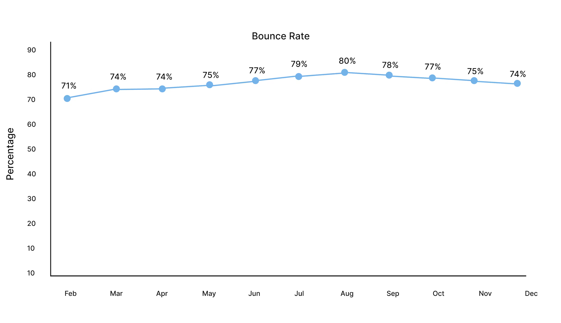
UX.Report faces high bounce rates on its platform, impacting user engagement, customer conversions, and overall business growth. Addressing this issue is vital to enhance engagement, boost conversions, and maintain its leadership in digital experience optimization.

Business Problem
Task analysis
Usability Expert
Review
Brief
Problem Discovery
Solution Discovery


There is no main product visiual
The animation dose not explain what the product does
There is a possibility to paste in password fields
Lack of copy explaining the dashboard when you register
There is no free trail or sneak peek
The home page is professionally designed
It’s not clear what the website does
Enhance Visual and Copy Clarity
Adding a prominent product image, concise dashboard descriptions, and an engaging animation that clearly communicates the product’s purpose will improve user understanding.
Encourage Trial Engagement
Offering a free trial or sneak peek can increase user confidence and incentivize them to explore the product further.


Learnability
Bad
Efficiency
Room to improve
Learnability, Error
Room to improve
Carl Caterpillar
Good
Efficiency
Bad
Efficiency
Good
5 Why Analysis
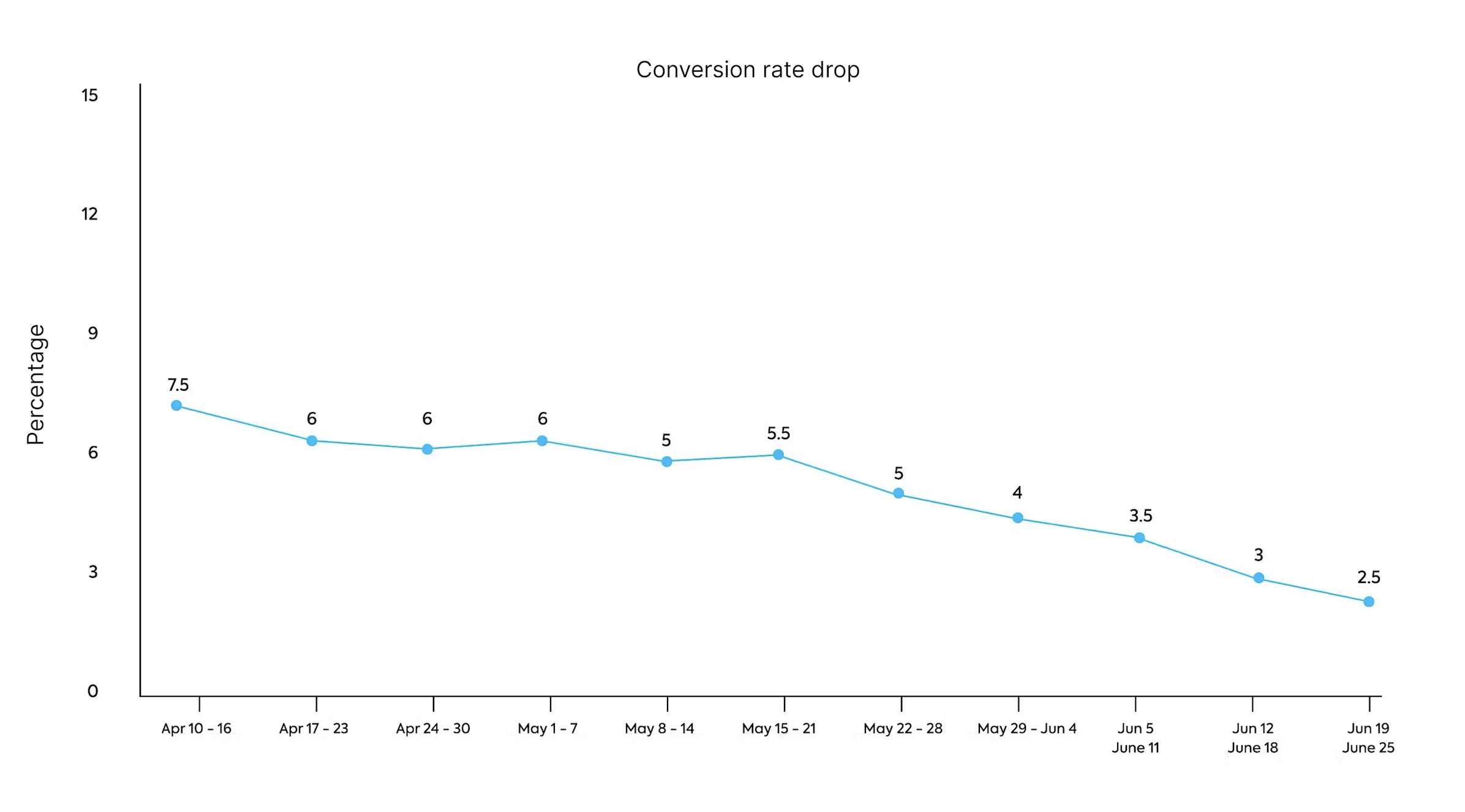
Problem: Low conversion rates in UX.Report
Why
Users drop out of the website.
Why
They don’t finish their registration.
Why
They don’t pay for the product.
Why
They can’t see the inside of the product and how it works.
Why
There is no demonstration or inside of the product (video, dashboard).
UX.Report was designed to achieve quick, practical, and actionable insights for website owners, agencies, freelancers, and consultants to optimise User Experience and drive marketing results.
I have observed (through task analysis and usability evaluation) that users don’t fully understand the main goal of the site, struggle to visualise the platform’s capabilities, and are confused by the lack of upfront product transparency, such as pricing, usage instructions, or a free trial. Additionally, the visual design does not effectively showcase the platform’s value.
These issues are causing high bounce rates, reduced engagement, and low conversion rates, which negatively impact the user retention.
Suggestions
I believe we will achieve lower bounce rates and increased conversion rates if our target users attain clarity and confidence about the product’s value with the following features:
A clearer main copy text to ensure users immediately grasp the platform’s purpose and benefits.
A dashboard screenshot or preview on the landing page, giving users a tangible sense of what the platform looks like and what they can expect after purchase.
A free trial or a no-cost feature overview, enabling users to explore the product’s capabilities risk-free before committing financially.
A “How It’s Done” or “How to Use” video, providing a concise and visually engaging tutorial midway through the landing page.
Transparent pricing displayed beneath the CTA button, offering users clear information to support their decision-making process.
<
All Audits
Hero Block
Problem Agitation
Clear solution
Social proof
Desired action
Storytelling
Support

Mihaela Mihova
eli.mihova.vm@gmail...
QuEx Landing page results
Hero block
32%
Problem agitation
22%
Social proof
23%
Desired Action
12%
Clear solution
65%
Storytelling
42%
itasse risus elementum erat amet put
cies sapien purus eleifend. Eros dignissim diam sed donec pretium. Nibh placerat volutpat aliquam tellus
Lorem ipsum dolor sit amet consectetur. Auctor et dui id gravida orci vel aliquam donec. Velit commodo
an venenatis dolor ullamcorper sagittis. Tincidunt arcu vestibulum malesuada nec faucibus tristique lore
scelerisque mauris amet. Lorem blandit scelerisque gravida semper in. Sit varius
amet purus mauris egestas. Quam egestas facilisi elit sed volutpat. Pulvinar auctor scelerisque ma
Overall Score
26%


Transform Your Website with Fast and Actionable Feedback in Seconds
Quickly analyze websites and get practical recommendations to deliver results for clients. Ideal for agencies, freelancers, consultants, or business owners looking to stay ahead
Start Your Analysis
Pricing
Free
Try a preview of our service and decide later if it meets your needs
$0
1 Project
Up to 10 insights
Fast loading times
Priority Support
Freelancer
Perfect for freelancers and consultants seeking to enhance their toolkit
$20/month
Up to 2 projects per month
Unlimited insights
Fast loading times
Free Updates
Priority in email support
Agency
Ideal for agencies looking to strengthen their offerings and attract more clients
$90/month
Unlimited projects
Unlimited insights
Beta features early access
Fast loading times
Free Updates
Priority support
Start Your Analysis
Reviews Designed to
Meet Your Exact Needs
For Studios Providing Auditing Services
Strengthen your audit services: Our detailed assessments offer valuable insights that enhance the effectiveness of your audits, enabling you to deliver precise, actionable feedback that boosts client satisfaction and solidifies your reputation as a leading service provider

For Freelancers and Consultant Designers
Help Your Clients Shine: Our audits deliver focused recommendations to boost your clients’ digital presence, leading to higher conversion rates, more engaging content, and greater project success. Elevate your status as a trusted expert and enhance your toolkit to offer even more effective solutions.
For Business Owners
Drive business growth: Our audits reveal key opportunities for improvement, leading to higher engagement, increased conversions, and a stronger online presence, empowering you to achieve better performance and greater success for your website

HOW TO USE
UX.Report

We help companies and individuals do good business better
Start Your Analysis
Copyright (c) 2023-2024 · All rights reserved
Get in touch
Cookie Policy
Privacy Policy
Let’s Take Your
Services to the Next Level


Vision
Changelog
Pricing
Contact
Login
Register
Email Templates
Boost your emails — We optimize design, layout, and calls to action to improve open rates and drive engagement, ensuring your emails convert
Coming soon
Landing Pages
UX.Report analyzes key elements like the hero block, problem framing, clear solution, social proof, primary action, and engaging narrative to maximize conversions
Available
Thank you for reading!

Let’s work together
Improve the UX.Report Platform
Case Study
7 min read
20 Dec 2024
Project Course
SoftUni Design Advanced
UX.Report faces high bounce rates on its platform, impacting user engagement, customer conversions, and overall business growth. Addressing this issue is vital to enhance engagement, boost conversions, and maintain its leadership in digital experience optimization.

Business Problem
Task analysis
Usability Expert
Review
Brief
Problem Discovery
Solution Discovery


There is no main product visiual
The animation dose not explain what the product does
There is a possibility to paste in password fields
Lack of copy explaining the dashboard when you register
There is no free trail or sneak peek
The home page is professionally designed
It’s not clear what the website does
Enhance Visual and Copy Clarity
Adding a prominent product image, concise dashboard descriptions, and an engaging animation that clearly communicates the product’s purpose will improve user understanding.
Encourage Trial Engagement
Offering a free trial or sneak peek can increase user confidence and incentivize them to explore the product further.


5 Why Analysis
Problem: Low conversion rates in UX.Report
Why
Users drop out of the website.
Why
They don’t finish their registration.
Why
They don’t pay for the product.
Why
They can’t see the inside of the product and how it works.
Why
There is no demonstration or inside of the product (video, dashboard).
UX.Report was designed to achieve quick, practical, and actionable insights for website owners, agencies, freelancers, and consultants to optimise User Experience and drive marketing results.
I have observed (through task analysis and usability evaluation) that users don’t fully understand the main goal of the site, struggle to visualise the platform’s capabilities, and are confused by the lack of upfront product transparency, such as pricing, usage instructions, or a free trial. Additionally, the visual design does not effectively showcase the platform’s value.
These issues are causing high bounce rates, reduced engagement, and low conversion rates, which negatively impact the user retention.
Suggestions
I believe we will achieve lower bounce rates and increased conversion rates if our target users attain clarity and confidence about the product’s value with the following features:
A clearer main copy text to ensure users immediately grasp the platform’s purpose and benefits.
A dashboard screenshot or preview on the landing page, giving users a tangible sense of what the platform looks like and what they can expect after purchase.
A free trial or a no-cost feature overview, enabling users to explore the product’s capabilities risk-free before committing financially.
A “How It’s Done” or “How to Use” video, providing a concise and visually engaging tutorial midway through the landing page.
Transparent pricing displayed beneath the CTA button, offering users clear information to support their decision-making process.
<
All Audits
Hero Block
Problem Agitation
Clear solution
Social proof
Desired action
Storytelling
Support

Mihaela Mihova
eli.mihova.vm@gmail...
QuEx Landing page results
Hero block
32%
Problem agitation
22%
Social proof
23%
Desired Action
12%
Clear solution
65%
Storytelling
42%
itasse risus elementum erat amet put
cies sapien purus eleifend. Eros dignissim diam sed donec pretium. Nibh placerat volutpat aliquam tellus
Lorem ipsum dolor sit amet consectetur. Auctor et dui id gravida orci vel aliquam donec. Velit commodo
an venenatis dolor ullamcorper sagittis. Tincidunt arcu vestibulum malesuada nec faucibus tristique lore
scelerisque mauris amet. Lorem blandit scelerisque gravida semper in. Sit varius
amet purus mauris egestas. Quam egestas facilisi elit sed volutpat. Pulvinar auctor scelerisque ma
Overall Score
26%


Transform Your Website with Fast and Actionable Feedback in Seconds
Quickly analyze websites and get practical recommendations to deliver results for clients. Ideal for agencies, freelancers, consultants, or business owners looking to stay ahead
Start Your Analysis
Pricing
Free
Try a preview of our service and decide later if it meets your needs
$0
1 Project
Up to 10 insights
Fast loading times
Priority Support
Freelancer
Perfect for freelancers and consultants seeking to enhance their toolkit
$20/month
Up to 2 projects per month
Unlimited insights
Fast loading times
Free Updates
Priority in email support
Agency
Ideal for agencies looking to strengthen their offerings and attract more clients
$90/month
Unlimited projects
Unlimited insights
Beta features early access
Fast loading times
Free Updates
Priority support
Start Your Analysis
Reviews Designed to
Meet Your Exact Needs
For Studios Providing Auditing Services
Strengthen your audit services: Our detailed assessments offer valuable insights that enhance the effectiveness of your audits, enabling you to deliver precise, actionable feedback that boosts client satisfaction and solidifies your reputation as a leading service provider

For Freelancers and Consultant Designers
Help Your Clients Shine: Our audits deliver focused recommendations to boost your clients’ digital presence, leading to higher conversion rates, more engaging content, and greater project success. Elevate your status as a trusted expert and enhance your toolkit to offer even more effective solutions.
For Business Owners
Drive business growth: Our audits reveal key opportunities for improvement, leading to higher engagement, increased conversions, and a stronger online presence, empowering you to achieve better performance and greater success for your website
HOW TO USE
UX.Report

We help companies and individuals do good business better
Start Your Analysis
Copyright (c) 2023-2024 · All rights reserved
Get in touch
Cookie Policy
Privacy Policy
Let’s Take Your
Services to the Next Level


Vision
Changelog
Pricing
Contact
Login
Register
Email Templates
Boost your emails — We optimize design, layout, and calls to action to improve open rates and drive engagement, ensuring your emails convert
Coming soon
Landing Pages
UX.Report analyzes key elements like the hero block, problem framing, clear solution, social proof, primary action, and engaging narrative to maximize conversions
Available
Thank you for reading!

Let’s work together
Improve the UX.Report Platform
Case Study
7 min read
20 Dec 2024
Project Course
SoftUni Design Advanced
UX.Report faces high bounce rates on its platform, impacting user engagement, customer conversions, and overall business growth. Addressing this issue is vital to enhance engagement, boost conversions, and maintain its leadership in digital experience optimization.

Business Problem
Task analysis
Usability Expert
Review
Brief
Problem Discovery
Solution Discovery


There is no main product visiual
The animation dose not explain what the product does
There is a possibility to paste in password fields
Lack of copy explaining the dashboard when you register
There is no free trail or sneak peek
The home page is professionally designed
It’s not clear what the website does
Enhance Visual and Copy Clarity
Adding a prominent product image, concise dashboard descriptions, and an engaging animation that clearly communicates the product’s purpose will improve user understanding.
Encourage Trial Engagement
Offering a free trial or sneak peek can increase user confidence and incentivize them to explore the product further.


Learnability
Bad
Efficiency
Room to improve
Learnability, Error
Room to improve
Efficiency
Good
Efficiency
Bad
Efficiency
Good
5 Why Analysis
Problem: Low conversion rates in UX.Report
Why
Users drop out of the website.
Why
They don’t finish their registration.
Why
They don’t pay for the product.
Why
They can’t see the inside of the product and how it works.
Why
There is no demonstration or inside of the product (video, dashboard).
UX.Report was designed to achieve quick, practical, and actionable insights for website owners, agencies, freelancers, and consultants to optimise User Experience and drive marketing results.
I have observed (through task analysis and usability evaluation) that users don’t fully understand the main goal of the site, struggle to visualise the platform’s capabilities, and are confused by the lack of upfront product transparency, such as pricing, usage instructions, or a free trial. Additionally, the visual design does not effectively showcase the platform’s value.
These issues are causing high bounce rates, reduced engagement, and low conversion rates, which negatively impact the user retention.
Suggestions
I believe we will achieve lower bounce rates and increased conversion rates if our target users attain clarity and confidence about the product’s value with the following features:
A clearer main copy text to ensure users immediately grasp the platform’s purpose and benefits.
A dashboard screenshot or preview on the landing page, giving users a tangible sense of what the platform looks like and what they can expect after purchase.
A free trial or a no-cost feature overview, enabling users to explore the product’s capabilities risk-free before committing financially.
A “How It’s Done” or “How to Use” video, providing a concise and visually engaging tutorial midway through the landing page.
Transparent pricing displayed beneath the CTA button, offering users clear information to support their decision-making process.
<
All Audits
Hero Block
Problem Agitation
Clear solution
Social proof
Desired action
Storytelling
Support
Mihaela Mihova
eli.mihova.vm@gmail...
QuEx Landing page results
Hero block
32%
Problem agitation
22%
Social proof
23%
Desired Action
12%
Clear solution
65%
Storytelling
42%
itasse risus elementum erat amet put
cies sapien purus eleifend. Eros dignissim diam sed donec pretium. Nibh placerat volutpat aliquam tellus
Lorem ipsum dolor sit amet consectetur. Auctor et dui id gravida orci vel aliquam donec. Velit commodo
an venenatis dolor ullamcorper sagittis. Tincidunt arcu vestibulum malesuada nec faucibus tristique lore
scelerisque mauris amet. Lorem blandit scelerisque gravida semper in. Sit varius
amet purus mauris egestas. Quam egestas facilisi elit sed volutpat. Pulvinar auctor scelerisque ma
Overall Score
26%


Transform Your Website with Fast and Actionable Feedback in Seconds
Quickly analyze websites and get practical recommendations to deliver results for clients. Ideal for agencies, freelancers, consultants, or business owners looking to stay ahead
Start Your Analysis
Pricing
Free
Try a preview of our service and decide later if it meets your needs
$0
1 Project
Up to 10 insights
Fast loading times
Priority Support
Freelancer
Perfect for freelancers and consultants seeking to enhance their toolkit
$20/month
Up to 2 projects per month
Unlimited insights
Fast loading times
Free Updates
Priority in email support
Agency
Ideal for agencies looking to strengthen their offerings and attract more clients
$90/month
Unlimited projects
Unlimited insights
Beta features early access
Fast loading times
Free Updates
Priority support
Start Your Analysis
Reviews Designed to
Meet Your Exact Needs
For Studios Providing Auditing Services
Strengthen your audit services: Our detailed assessments offer valuable insights that enhance the effectiveness of your audits, enabling you to deliver precise, actionable feedback that boosts client satisfaction and solidifies your reputation as a leading service provider

For Freelancers and Consultant Designers
Help Your Clients Shine: Our audits deliver focused recommendations to boost your clients’ digital presence, leading to higher conversion rates, more engaging content, and greater project success. Elevate your status as a trusted expert and enhance your toolkit to offer even more effective solutions.
For Business Owners
Drive business growth: Our audits reveal key opportunities for improvement, leading to higher engagement, increased conversions, and a stronger online presence, empowering you to achieve better performance and greater success for your website
HOW TO USE
UX.Report

We help companies and individuals do good business better
Start Your Analysis
Copyright (c) 2023-2024 · All rights reserved
Get in touch
Cookie Policy
Privacy Policy
Let’s Take Your
Services to the Next Level


Vision
Changelog
Pricing
Contact
Login
Register
Email Templates
Boost your emails — We optimize design, layout, and calls to action to improve open rates and drive engagement, ensuring your emails convert
Coming soon
Landing Pages
UX.Report analyzes key elements like the hero block, problem framing, clear solution, social proof, primary action, and engaging narrative to maximize conversions
Available
Thank you for reading!

Let’s work together

Improve the UX.Report Platform
Case Study
7 min read
20 Dec 2024
Project Course
SoftUni Design Advanced
UX.Report faces high bounce rates on its platform, impacting user engagement, customer conversions, and overall business growth. Addressing this issue is vital to enhance engagement, boost conversions, and maintain its leadership in digital experience optimisation.
Business Problem
Task analysis
Usability Expert
Review
Brief
Problem Discovery
Solution Discovery
There is no main product visiual
The animation dose not explain what the product does
There is a possibility to paste in password fields
Lack of copy explaining the dashboard when you register
There is no free trail or sneak peek
The home page is professionally designed
It’s not clear what the website does
Enhance Visual and Copy Clarity
Adding a prominent product image, concise dashboard descriptions, and an engaging animation that clearly communicates the product’s purpose will improve user understanding.
Encourage Trial Engagement
Offering a free trial or sneak peek can increase user confidence and incentivize them to explore the product further.
5 Why Analysis
Problem: Low conversion rates in UX.Report
Why
Users drop out of the website.
Why
They don’t finish their registration.
Why
They don’t pay for the product.
Why
They can’t see the inside of the product and how it works.
Why
There is no demonstration or inside of the product (video, dashboard).
UX.Report was designed to achieve quick, practical, and actionable insights for website owners, agencies, freelancers, and consultants to optimise User Experience and drive marketing results.
I have observed (through task analysis and usability evaluation) that users don’t fully understand the main goal of the site, struggle to visualise the platform’s capabilities, and are confused by the lack of upfront product transparency, such as pricing, usage instructions, or a free trial. Additionally, the visual design does not effectively showcase the platform’s value.
These issues are causing high bounce rates, reduced engagement, and low conversion rates, which negatively impact the user retention.
Suggestions
I believe we will achieve lower bounce rates and increased conversion rates if our target users attain clarity and confidence about the product’s value with the following features:
A clearer main copy text to ensure users immediately grasp the platform’s purpose and benefits.
A dashboard screenshot or preview on the landing page, giving users a tangible sense of what the platform looks like and what they can expect after purchase.
A free trial or a no-cost feature overview, enabling users to explore the product’s capabilities risk-free before committing financially.
A “How It’s Done” or “How to Use” video, providing a concise and visually engaging tutorial midway through the landing page.
Transparent pricing displayed beneath the CTA button, offering users clear information to support their decision-making process.
<
All Audits
Hero Block
Problem Agitation
Clear solution
Social proof
Desired action
Storytelling
Support
Mihaela Mihova
eli.mihova.vm@gmail...
QuEx Landing page results
Hero block
32%
Problem agitation
22%
Social proof
23%
Desired Action
12%
Clear solution
65%
Storytelling
42%
itasse risus elementum erat amet put
cies sapien purus eleifend. Eros dignissim diam sed donec pretium. Nibh placerat volutpat aliquam tellus
Lorem ipsum dolor sit amet consectetur. Auctor et dui id gravida orci vel aliquam donec. Velit commodo
an venenatis dolor ullamcorper sagittis. Tincidunt arcu vestibulum malesuada nec faucibus tristique lore
scelerisque mauris amet. Lorem blandit scelerisque gravida semper in. Sit varius
amet purus mauris egestas. Quam egestas facilisi elit sed volutpat. Pulvinar auctor scelerisque ma
Overall Score
26%

Transform Your Website with Fast and Actionable Feedback in Seconds
Quickly analyze websites and get practical recommendations to deliver results for clients. Ideal for agencies, freelancers, consultants, or business owners looking to stay ahead
Start Your Analysis
Pricing
Free
Try a preview of our service and decide later if it meets your needs
$0
1 Project
Up to 10 insights
Fast loading times
Priority Support
Freelancer
Perfect for freelancers and consultants seeking to enhance their toolkit
$20/month
Up to 2 projects per month
Unlimited insights
Fast loading times
Free Updates
Priority in email support
Agency
Ideal for agencies looking to strengthen their offerings and attract more clients
$90/month
Unlimited projects
Unlimited insights
Beta features early access
Fast loading times
Free Updates
Priority support
Start Your Analysis
Reviews Designed to
Meet Your Exact Needs
For Studios Providing Auditing Services
Strengthen your audit services: Our detailed assessments offer valuable insights that enhance the effectiveness of your audits, enabling you to deliver precise, actionable feedback that boosts client satisfaction and solidifies your reputation as a leading service provider
For Freelancers and Consultant Designers
Help Your Clients Shine: Our audits deliver focused recommendations to boost your clients’ digital presence, leading to higher conversion rates, more engaging content, and greater project success. Elevate your status as a trusted expert and enhance your toolkit to offer even more effective solutions.
For Business Owners
Drive business growth: Our audits reveal key opportunities for improvement, leading to higher engagement, increased conversions, and a stronger online presence, empowering you to achieve better performance and greater success for your website
HOW TO USE
UX.Report
We help companies and individuals do good business better
Start Your Analysis
Copyright (c) 2023-2024 · All rights reserved
Get in touch
Cookie Policy
Privacy Policy
Let’s Take Your
Services to the Next Level
Vision
Changelog
Pricing
Contact
Login
Register
Email Templates
Boost your emails — We optimize design, layout, and calls to action to improve open rates and drive engagement, ensuring your emails convert
Coming soon
Landing Pages
UX.Report analyzes key elements like the hero block, problem framing, clear solution, social proof, primary action, and engaging narrative to maximize conversions
Available
Thank you for reading!

Let’s work together